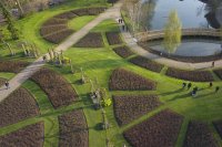
Opinions on these images please

swisser

Member
Considering the creative potential for AP shots, which of these images has most impact do you think? Put another way, if you could only show someone one image to say "isn't aerial photography interesting", which would you choose? You're welcome to say they're all rubbish, but then which one is least rubbish?!

Am going to tweet some others later for anyone who is interested (follow http://twitter.com/AerialPhotoUK).

Thanks.


View attachment 6455


View attachment 6456


View attachment 6457
 

Attachments

  • DSC02817-1.jpeg
    DSC02817-1.jpeg
    90 KB · Views: 384
  • DSC03087.jpeg
    DSC03087.jpeg
    147.8 KB · Views: 369
  • DSC00198.jpeg
    DSC00198.jpeg
    162.2 KB · Views: 327

jes1111

Active Member
Aesthetically, I'd choose No.2 (although time of day could have been better ;))
No.3 is a bit messy as a composition and doesn't suggest any story.
No.1 is a cliché, and not the ideal rule-of-thirds composition - but that's the one I'd use - it's what people "expect" AP to look like ;)

:)
 
Last edited by a moderator:

Stacky

Member
I love all of them although #3 is probably the weakest. Depending on the end user and their needs any of those images could be sold. I had a peek at your website, some really nice images on there.
All the best.
 
Last edited by a moderator:

LowFlier

Member
I have to disagree. I'm no photographer, just someone looking at pics, so you'll have to take my opinion in that context. I don't know jack about composition, etc.

1. This picture messes with my eyes. It seems like it was taken looking down and back a little, making the perspective seem as if the POV is slightly upside down. I don't know why it looks that way to me, but it makes me uneasy. I'm sure it's just me, but I had a hard time looking past that.

2. This is a beautiful picture, but I looked at it for maybe 3 seconds and I was done. It just didn't hold my attention.

3. I liked this one the best. Whereas I bailed on #1 quickly and found little of interest in #2, this picture held my attention. No, there's no story, but there is a lot to hold my interest. I spent a good 45 seconds visually wandering over it and taking in the details. It made me want to be there.

Like I said, I'm not the person to ask about the technical details. I'm just giving my opinion. I would probably have preferred #1 if it had been shot from a different angle. I would have likely found #2 more interesting if it had been a little more zoomed in on the boats and a little less sunlight-reflected-on-the-water.

Of course, I wouldn't know art if I tripped and fell into it. <shrug>
 

Macsgrafs

Active Member
Froma Pro's point of view.

1)too boring, straight down very rarely works, always try & get an agle on your subject matter.

2)Love the composition, but the water glare spoils it...try reshooting ona calm day without the waves & light reflections.

3)This is the best of the 3, still not 100% but a great photo. The path on the left, would look far better if it was coming from the bottom left corner & leading our eyes into the shot, a bit more of the lake/pond would be nice as I think its the main point of interest to be honest with you.

Ross


Stacky

Member
Its funny and at the same time quite cool how we all see things differently. I have one image i took for a job which i absolutely hate but its now been used a number of times for different publications and brochures. Ive had other images I love that never got used.


jes1111

Active Member
I thought #1 looked a bit "muddy", so I pulled it into PS and discovered that you'd left the Adobe RGB profile on it. You definitely want to convert to sRGB before putting it on the web (or to clients, for that matter). I tried the Adobe RGB space for a long time, convinced (by the hype) that it was "better" - gave up in the end: could never see a worthwhile difference in the end result. Plain old sRGB (and a calibrated monitor) and you're good to go, IMO. If you're printing for exhibitions, then "maybe" it's worth putting up with the workflow hassle - I'd be interested in Stacky's opinion.

View attachment 6463View attachment 6464
Converted to sRGB
 

Attachments

  • DSC02817-1.jpeg
    DSC02817-1.jpeg
    90 KB · Views: 249
  • DSC02817-1a.jpg
    DSC02817-1a.jpg
    86.5 KB · Views: 253
Last edited by a moderator:

DucktileMedia

Drone Enthusiast
They are all nice. If you were targeting architectural clients obviously #3 is great. I think #1 and #2 are clearly aerial shots where 3 could have been taken from a high rise. I think #3 is still the best all around as it has some color and geometry to it.
 

Stacky

Member
Well to be honest Im not the best person to talk to about workflow and raw file handling because of the type of work I do. Its been years since i had to deal with the whole workflow side of things. The ad agencies I work for prefer the raw files I provide. I used to worry about that quite a bit but the ad agencies I work for employee large numbers of people who are trained in prepress etc. At my end I simply make sure i keep my white balance set as perfectly as i can. For example this week I shot 2 full days worth of models for an Australasian building and tool supplier called "Bunnings". I shot over 3000 frames and I have had a full weeks work so editing etc would have taken me another day or 2, luckily the client has that sorted.

I just checked my 5d2 that i shot with this week and it is indeed set to sRGB, I vaguely remember setting it to that a few years ago and havent checked since then till just now. I also use a Hasseldlad H4D-50MS and I use the Hasselblad colour space setting with that and my clients handle those raw files too. That doesnt sound very professional I know.... ( I do calibrate my monitors on a regular basis though!)

Its an awful thing but I hand over control of my images to my clients by handing over raw files however I rarely end up being disappointed with what they do and it has meant I am not doing huge amounts of computer work. When I used to shoot everything with transparency my only control there was using the right film for the right job and push/pull processing adjustments. The sad thing is that I dont have many transparencies from those days as it was all commercial work and everything went to the client. These days at least I retain a copy of everything.

A lot of photographers do prefer to handle the workflow and dont hand over raw images but my line of work doesnt allow that. In all honesty I wish i did keep a handle on it but it would mean a big change to how much time a job takes. Sadly these days the timelines for taking images to being printed have shrunk to such an extent there is no room for any error. In 2 weeks time I am shooting a brochure for Maserati via an Australian ad agency. The art director is flying over for 2 days shooting and he expects to take all the images with him on the plane when he flies home, which will be about 2 hours after we finish shooting. Stupid really, no room for any mistakes.

I am pretty sure jes has a far better grasp of colour space and workflow than I do, I am embarrassed to say its not something I have had to worry about, its been handled by others better at it than me. Also all my clients have people who are experts at converting to CMYK which is a black art in itself. On the flip side i am very particular about white balance etc as in the days of film it was critical. I do miss the days of film, I had to be more particular about how I lit things and got to spend more time doing light readings etc because clients didnt like to pay for lots of polaroids. I also miss the more sensible and thoughtful timelines, Im pretty sure the quality of my work has suffered over the last 10 years because I have to shoot so much faster and get less time to make the lighting pretty. I also miss the smell of polaroid....

Edit: jes you have done me a favour, I have 2 5d2 bodies and I had 1 set to adobe rgb and 1 set to sRGB...
 
Last edited by a moderator:


jes1111

Active Member
I wish I had somebody to do the computer stuff after shooting - takes me hours and hours - usually much longer than the shoot itself. I use HDR a lot - not the gunky, mucky crap you see on Flickr! - to "extend" the dynamic range (harsh Mediterranean sun, deep shadows). I always shoot from a tripod, seven shots bracketed, so the workflow back at the office is a nightmare. This is one of the things that's bugging me with AP - a few times I've managed to "auto-align" a bracketed set, but that's rare. So I'm having to learn "all over again" how to squeeze the best out of a single raw file ;)

What you said about margin for error - I agree, it can fray the nerves. I'm not the world's greatest photographer by a long way, but I do call myself "a professional" - the distinction being, in my mind, that when someone is paying for the shots then there can be no excuses, no failures - you simply have to deliver - and that skill/ability is the one thing that can lift you above the many, many so-called "amateurs" who are much better photographers than me.

Having "a good eye" on the ground is one thing - you can look the viewfinder, move, zoom, whatever - doing that with AP is obviously rather more difficult, particularly if you're one-man-crewing it. Many challenges ahead :)
 

DennyR

Active Member
It depends on what your aim is, If you want to cut the mustard in the big time then the subject matter is crucial. I think No.1 would be more saleable as a portrait, just rotate it L 90 degrees. No.2 could be cropped to loose most of the left hand side and No 3 is not what I would call a saleable subject matter. The preparation of images is important but with many raw image workflows available it is not a difficult task.

As for verticals not working, that is a load of old amateur bollocks, some of my best selling images are verticals. The creative pro. is someone who thinks outside of the box. That is what they pay him to do. The market place is awash with images like the one in 3. Nobody buys that kind of thing for decent money, if at all. The local municipality might give you 10 euros for it. Or a free mention in the local rag. I have sold vertical beach/boat images for a four figure sum in the past. Financial and Industrial institutions are the big spenders.

As a publisher, photographer and even picture buyer, I can say with confidence that images must be a lot different from the typical PPL out on a Sunday afternoon snapping away at 1000 ft. shooting down at 45deg. if you want to sell em. It is not enough to simply create a record shot because everybody can do that. Nobody will commission a photographer to do a highly paid shoot without seeing a portfolio of the kind of image they want.
 
Last edited by a moderator:

ChrisViperM

Active Member
I hope you don't mind, but my favorite would be this pic (taken from your site)....I would just cut it a little bit on the right side and on the bottom. Otherwise it's perfect for your porpose...It's dynamic, it's got a good angle and it implement's that it could have only been shot with some flying equipment (aka AP).....and it's very educational to read all this posts.


Chris
 

Attachments

  • DSC_0008.JPG.jpg
    DSC_0008.JPG.jpg
    111 KB · Views: 290

DennyR

Active Member
From a publishing aspect one has to look a little further than your average camera club rules of composition. It's about utilization of the page area as most editors will crop out most of what is know as white space. The juxtaposition of titles and other text overlay has to be considered at the time of shooting. Color is also important as some images struggle to take an overlay due to shadow areas or whites. Cover shots (which pay the best) need to be bright and colorful. This means often shooting a less tight composition to give some designer considerations. In other words shoot your *** off, the digital files have no cost and are the cheapest part of the assignment.
 
Last edited by a moderator:

Macsgrafs

Active Member
DennyR is right, you must remember lots of shots end up on A4 size material, so what looks good to us wont be the same to the photo editors!
 

DennyR

Active Member
The next consideration is that of learning how to work with CMYK not RGB and getting your head around color profiles etc. Strange things can happen if you are not coordiated with the print house (Who is probably in China and doesn't speak your language very well). The Pro shooter is a big step from posting on the web. You need to be proficient with Quark and In-Design to fully understand what is going on
 
Last edited by a moderator:

Stacky

Member
There is a name from the past, i taught myself QuarkXpress about 12 years ago although its been a long time since i last messed with it. Getting the correct settings for CMYK for Chinese printers can be a big challenge in itself.

The next consideration is that of learning how to work with CMYK not RGB and getting your head around color profiles etc. Strange things can happen if you are not coordiated with the print house (Who is probably in China and doesn't speak your language very well). The Pro shooter is a big step from posting on the web. You need to be proficient with Quark and In-Design to fully understand what is going on
 

jes1111

Active Member
QuarkExpress, InDesign, CMYK conversion, black/white points, bleed allowance, moiré, overlays.... "familiar with...", sure, but not necessarily "proficient in...". I'm familiar with how an internal combustion engines works - helps me get the best from using it, but I don't need to be a mechanic to be a driver. ;)

Otherwise, I agree with Denny - subject matter, composition, light, colour, viewpoint, impact, story, saleability, usability... all adding up to what I would call the "it" factor. Agreed, too, on vertical shots (when well executed) - probably the best angle to exploit for saleable shots.
 

Top